CSA Group Translator Platform
The Canadian Standards Association (CSA) is a non-profit organization responsible for developing and maintaining standards to improve safety, sustainability, and performance across various industries in Canada.
The AI Translator project is a user-friendly web interface allowing CSA employees to upload and translate documents from English to French seamlessly. Through this interface, users can manage and track the status of their translation requests in real-time.

The Challenge of Designing a Simple Interface for Complex AI Processes
When designing a platform that integrates advanced AI, the objective isn’t to dazzle users with the technology behind it, but rather to simplify its complexity, making it intuitive and effortless for users to interact with. This was our challenge in creating an AI-powered translation platform for the Canadian Standards Association (CSA). While the foundation of the platform relied on sophisticated AI models and Natural Language Processing (NLP), our task was to present it in a way that required minimal cognitive load from the user.
For CSA, the need was clear: enable employees to seamlessly translate technical documents from English to Canadian French. However, achieving such a streamlined experience demanded more than just functional design; it required us to remove any unnecessary friction while ensuring that the system handled the complexities of the translation process in the background.
Designing for simplicity is often one of the hardest challenges a UX team faces. The fewer elements a user interacts with, the more carefully each has to be considered. The focus must shift toward anticipating potential pain points and ensuring that every click or action aligns with the user’s primary goal. It’s similar to designing tools like ChatGPT: while the interface appears minimal, there’s a vast amount of thoughtful design and logic at play to make it feel effortless and accessible.
The challenge with this platform wasn’t just about designing around the AI but making sure the AI functioned invisibly, allowing CSA employees to focus on their tasks without being overwhelmed by the technology itself.
Why CSA Turned to AI for Bilingual Translations
As part of Canada’s commitment to bilingualism, the Canadian Standards Association (CSA) must ensure that its technical standards and documents are accessible in both English and French. These documents, often hundreds of pages long, contained industry-specific terminology critical to the safety and compliance standards across various sectors. Manual translation is time-consuming, expensive and also prone to inaccuracies, leading to inconsistencies that could affect the meaning of these critical texts.
Traditional non-AI translation tools, like Google Translate, can handle simple text but often fail with industry-specific terms, missing the necessary context. For example, translating a word like “standard” might have different interpretations based on the industry—whether it’s healthcare, engineering, or construction.
As a result, CSA needed a more intelligent, contextually aware, AI-powered solution – one that could not only translate words but also comprehend the technical nuances of its material.
To address CSA's translation challenges, we built an AI-powered platform using Azure AI Translator's advanced NLP technology. The platform focused on real-time English-to-Canadian French translation, ensuring accuracy and handling industry-specific terminology with Azure's sophisticated language models.
Heuristic-Driven Design Approach: Crafting an Intuitive Experience
For this project, my design philosophy as the Design Lead was centered around one thing: the user. The experience needed to be intuitive for CSA Group’s internal teams, most of whom would interact with the platform daily to translate key documents. To achieve this, we leaned heavily on established UX heuristics, ensuring that every feature served a purpose and contributed to a smooth, distraction-free experience.
A significant part of this design process involved close collaboration with the development team, our internal product team, and CSA Group’s team, including their senior product designer and product experts. Together, we dove deep into how the backend operated to ensure that every complex action happening behind the scenes was considered.
For example, file validations were not just a backend function – they were thoughtfully designed as part of the frontend interface. Moreover, we anticipated potential issues that could arise during translation, such as long waiting times due to the size or complexity of the document. By working with the dev team, we ensured that the platform could handle these scenarios gracefully. Every interaction was designed to balance the backend’s complexities with the frontend’s simplicity, creating an effortless experience for the user.
Translation Dashboard
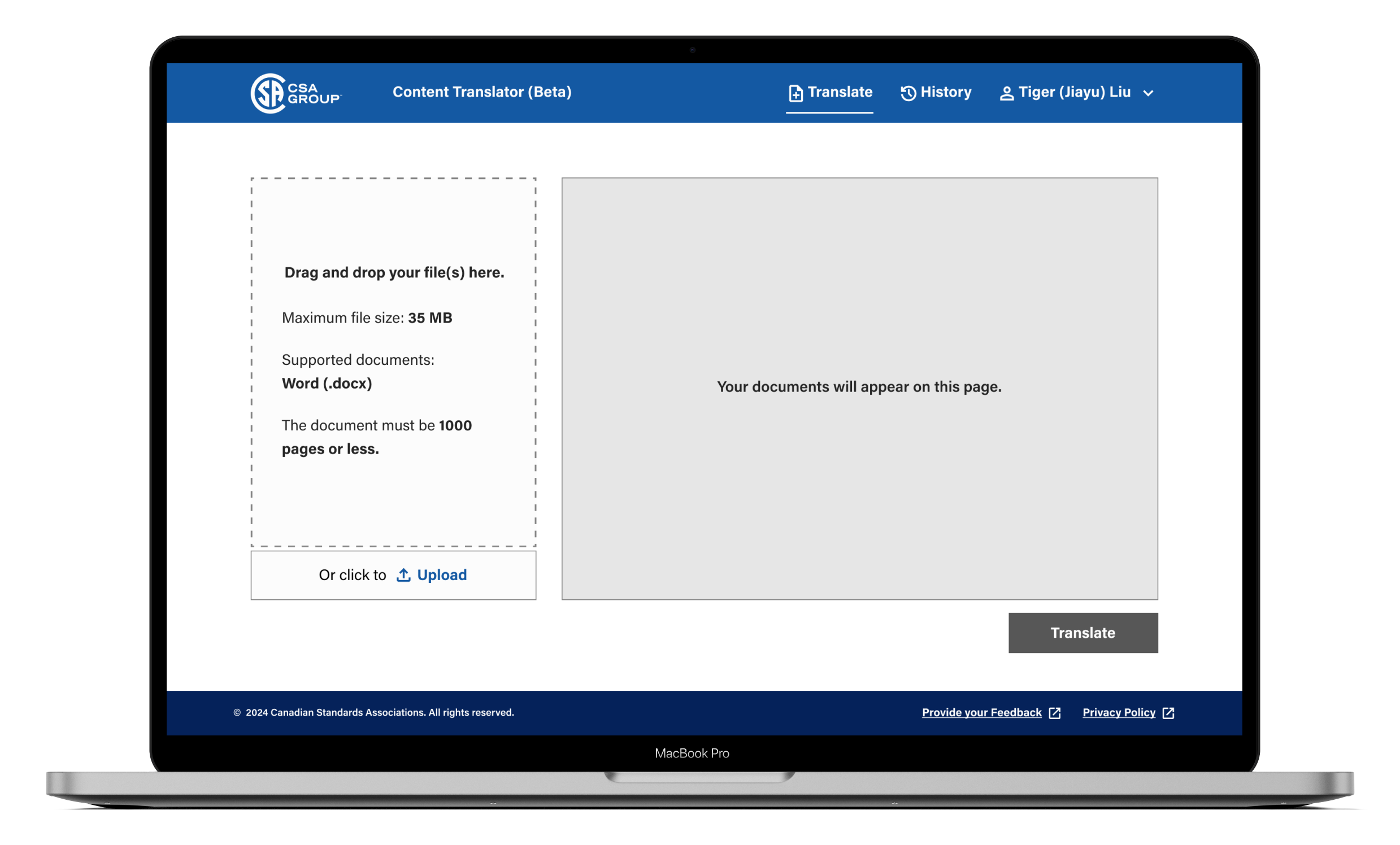
The platform’s UI was designed with a minimalist approach, focusing on only the essential elements:
- A drag-and-drop area for file uploads.
- A Translation Queue
- A single ‘Translate’ CTA (English to Canadian French).
- A history section to track the status of translations.
By stripping away unnecessary clutter, we ensured that users could focus solely on their task – uploading and translating documents – without distractions. This is a classic application of minimalism in UX, where fewer elements contribute to a more intuitive user experience.
By enabling both drag-and-drop functionality and a CTA button for uploading, the platform supports a range of user preferences, enhancing efficiency. Users who prefer a quick, intuitive action can drag and drop, while others can rely on the traditional button.

File Validation
When users uploaded files, the system automatically performed a series of validations to ensure the process would run smoothly. These validations included:
- Checking that files were in the correct format (.docx)
- Ensuring file sizes were within acceptable limits (Maximum file size: 35 MB)
- Ensuring number of pages were within acceptable limits (1000 pages or less)
- Avoiding duplicate uploads
If a file failed validation, users were immediately notified and could fix the issue before proceeding. This simple yet effective process ensured users didn’t encounter errors later in the workflow, maintaining a frictionless experience and prevent user frustration.

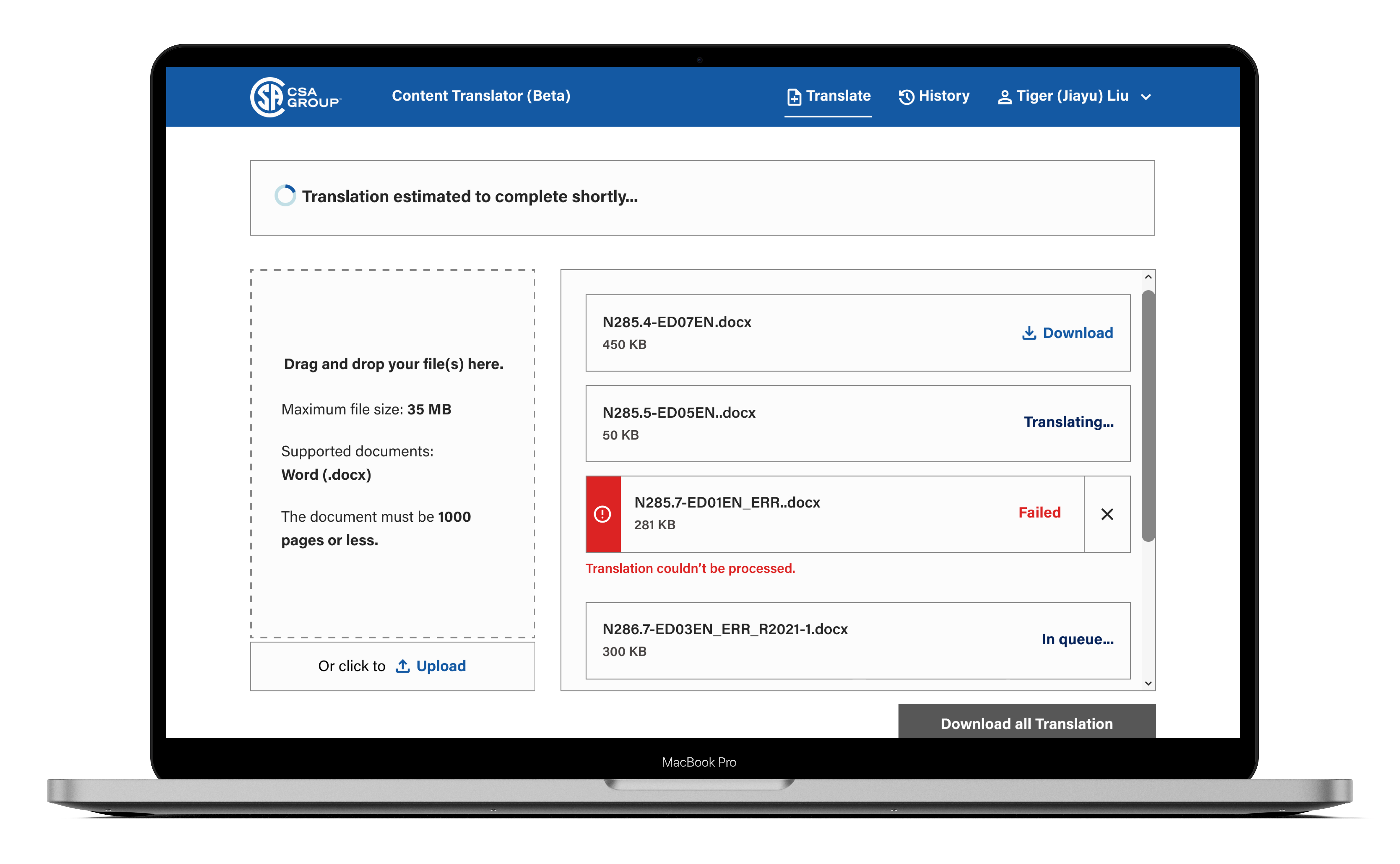
Translation Queue & Status Updates
One of our primary goals was to ensure that users were always aware of what was happening with their translation requests. We implemented a translation queue that displayed files in four clear stages:
- Next in line (In Queue…)
- Currently being translated (Translating…)
- Failed translations (Failed)
- Completed translations (Download)
Users could track the real-time status of each file, improving trust, reducing confusion and keeping them in control of the process. If a translation fails, users are not stuck – they can choose to retry the translation or download completed files successfully. This empowers users by giving them control over how they manage failed tasks and ensures they are not unnecessarily hindered by the system.

Download Options
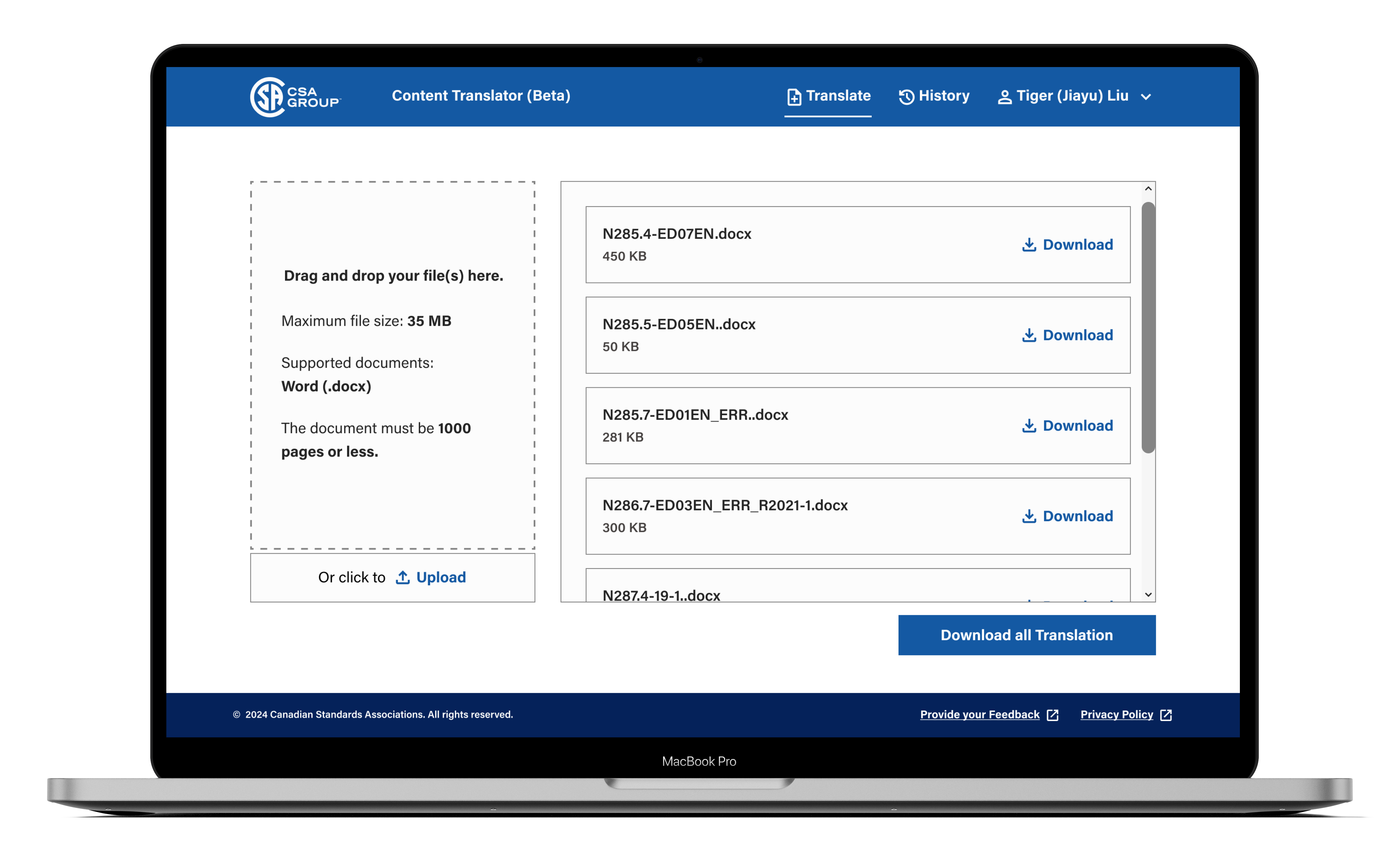
Once translations were completed, users had two options:
- Download individual files if they only needed certain documents.
- If all files were successfully translated, they could click a ‘Download All Translations’ button, which provided a zip file containing all the documents.
This approach enhances efficiency, allowing users to complete their task without waiting for perfect success across all files. Users can download files as per their convenience as we ensured that the platform is adapted to the specific needs of each individual.

Real-Time Translation History and Feedback
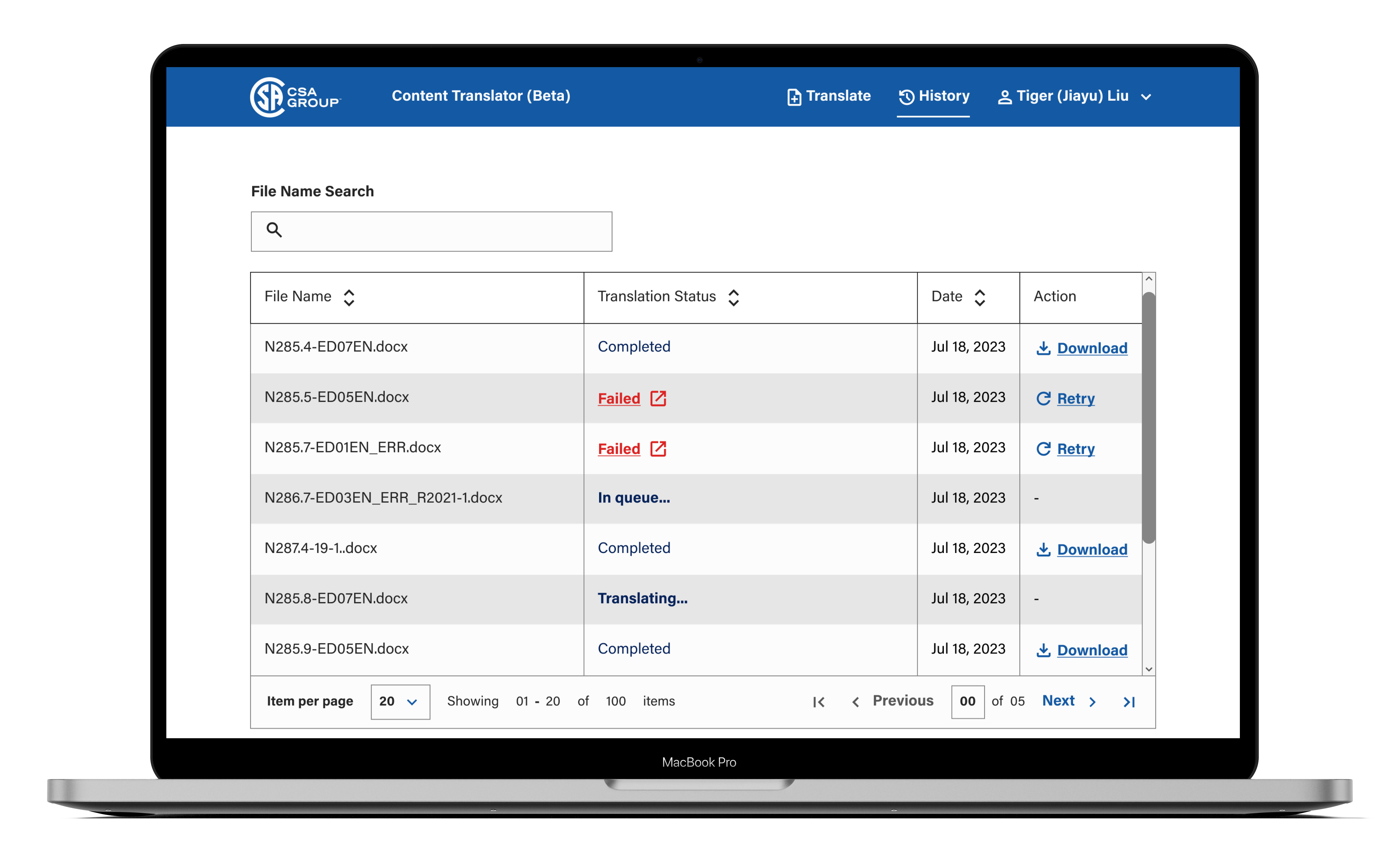
The history section provides users with full visibility of their translation activities, displaying all submitted files after the ‘Translate’ button is clicked. This section includes a ‘refresh’ icon to update the table with real-time translation status. Each file is listed with a corresponding status:
- Download: For files successfully translated, the user can immediately download them.
- Failed: For files that encountered an error, users are offered a retry option to attempt the translation again.
This clear feedback loop ensured that users always had control over the process.
By providing retry options for failed translations directly in the history section, the system gives users an easy way to fix problems without needing to leave the page or navigate to a different part of the platform. This promotes flexibility and improves the overall user experience.

Project Reflections & Growth
- Early AI Adoption:
Designing an AI-powered platform at a time when many companies are still grasping the potential of AI was an incredible opportunity. It allowed me to pioneer UX for AI-driven solutions, setting a foundation for future projects. - Leveraging CSA’s Design System:
Utilizing CSA Group’s design system significantly lightened the UI design load, enabling my team to focus on refining the user experience. It also gave me valuable experience working with another enterprise-level design system. - Accessibility Insights:
Collaborating with CSA, known for their stringent accessibility standards, was a transformative learning experience. The feedback and reviews from their product design lead, an expert in accessible design, were crucial to both the project’s success and my own growth in this area. - Collaborating with Development:
This project emphasized the importance of working closely with the dev team. Designing not just for the user interface, but for the complex AI technology running in the background, required deep collaboration to ensure the front-end reflected the intricacies of the backend.