In-Your-Pocket Healthcare
This was a healthcare concept project undertaken as a part of my UX Design course at Brainstation, Toronto. The design challenge was to create a native mobile app offering a creative design solution to an existing problem space in the healthcare industry. For this project, I concentrated on “India” as my demographic location. As the world’s second-most-populous country, the Indian healthcare scenario presents a spectrum of contrasting landscapes, unique challenges, and unprecedented opportunities.
An overview of the healthcare landscape in India:
India’s healthcare system is characterized by the coexistence of public and private health centers, poor public health infrastructure, high healthcare costs, and low insurance coverage. The government’s poor quality of services at public health centers and low insurance coverage lead to increased use of private health centers and high out-of-pocket-expenses (OOPE) in India.
Private sector healthcare in India is not well regulated but comprises about 80% of outpatient care and 60% inpatient care across the country. Private sector healthcare in India is mostly financed by out-of-pocket (OOP) payments – healthcare costs that a patient incurs and are not covered by insurance.
- Product Designer
- 10 Weeks
- Sketch, Figma, InVision
- Healthcare & Insurance
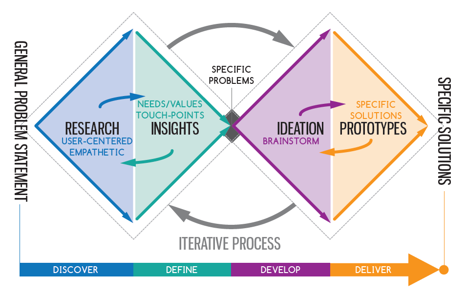
- Double Diamond Model
Research
About 70% of India’s population lives in rural areas, making it harder for these people to access care compared to those who live in urban areas.
For the 300 million Indian citizens who live below the poverty line, ordinary healthcare costs are prohibitively expensive.
From 2000 to 2015, total national healthcare expenditure in India consistently averaged around 4% of GDP each year, of which government expenditures comprised only around 1% of GDP.
Consequently, the Ministry of Health and Family Welfare estimates that the low government expenditure on healthcare leads to high out-of-pocket expenses. In fact, these out-of-pocket (OOP) expenses push 7% of the population into poverty each year.
India has a significant shortage of trained physicians nationwide as the WHO recommends a physician to population ratio of at least 1:1000, but India has a ratio of only 1:1674.
A 2012 study of six states in India revealed that many of the primary health centers (PHCs) lacked basic infrastructural facilities such as beds, wards, toilets, drinking water facilities, clean labor rooms for delivery, and regular electricity. India has just 90 beds per 100,000 population against a world average of 270 beds.
From 2000 to 2015, Out-of-pocket (OOP) payments in India have averaged around 69% of total healthcare expenditures. To help pay for healthcare costs, insurance is available, often provided by employers, but most of these vary significantly from policy to policy, and employer to employer, without any set standards, or clear information of benefits / reimbursement. Therefore for most young Indians out-of-pocket (OOP) costs make up a large portion of their spending on medical treatment in India.
How might we reduce the OOP expenses of an employed millenial in India, who already has a healthcare insurance, but still incurs significantly high medical expenses?
This research’s recruitment criteria are young millennials between 25-35 years old, living in India. They are employed at a managerial level and avail a health insurance benefit from their employer already.
For qualitative insights, I interviewed 5 target individuals. The aim was to delve deeper into their day-to-day healthcare experiences and habits to analyze their pain points, goals, and motivations around the identified problem.
- Employed millennials in India already get a health insurance from their employer. Even though they have an insurance, they still incur high medical costs.
- Medical insurance varies from policy to policy, and employer to employer. There are no set standards in medical insurance received from different companies.
- They do not have clear information available regarding their health benefits. They find it difficult to reimburse their medical bills as a time-consuming process.
- Lack of awareness about important issues regarding their own health. Their perception of their own health and supporting benefits is very laid-back.
Systhesis & Insights
After compiling my survey results, it was clear that most of my assumptions were correct. There is a definitive need for an Indian millennial for a creative solution that helps them be better informed about their benefits and reduce their OOP costs.
However, through my user interviews, I found out more qualitative data, which helped me ideate my solution better. I color-coded and divided my interview findings into emerging themes, which were then sorted based on key pain-points, frustrations, motivations, and goals. My key insights were:
- Key frustration: No Standard Policy. Health Insurance policies differ from employer to employer and there are no set standards of benefits received. Many patients therefore do not care much about their policy.
- Key pain point: Lack of proper benefits information. Many patients find it tedious to look for information about their own health benefits and how to claim insurance. Certain employers do not give a proper briefing about health benefits to employees, because of which patients end up paying OOP.
- Other pain points: No method to claim upfront. It is common knowledge that insurance money for outpatient procedures is claimed after treatment in India. Many patients are lazy to file these expenses as they are busy, or do not want to go through the hassle of a time-consuming process.
- Key behavior: Do not care about claiming affordable expenses. Inpatient care in India is affordable for an affluent millennial and therefore they do not care about reimbursements as they find the amount to be small and pay for it OOP just for convenience.
- Other behaviors: Lack of awareness about personal health issues. Many patients in India are not aware or conscious about getting regular health checkups, dental visits, or even know about a basic PAP test. Therefore they lack awareness about their own health issues and end up paying for expensive illnesses later OOP.
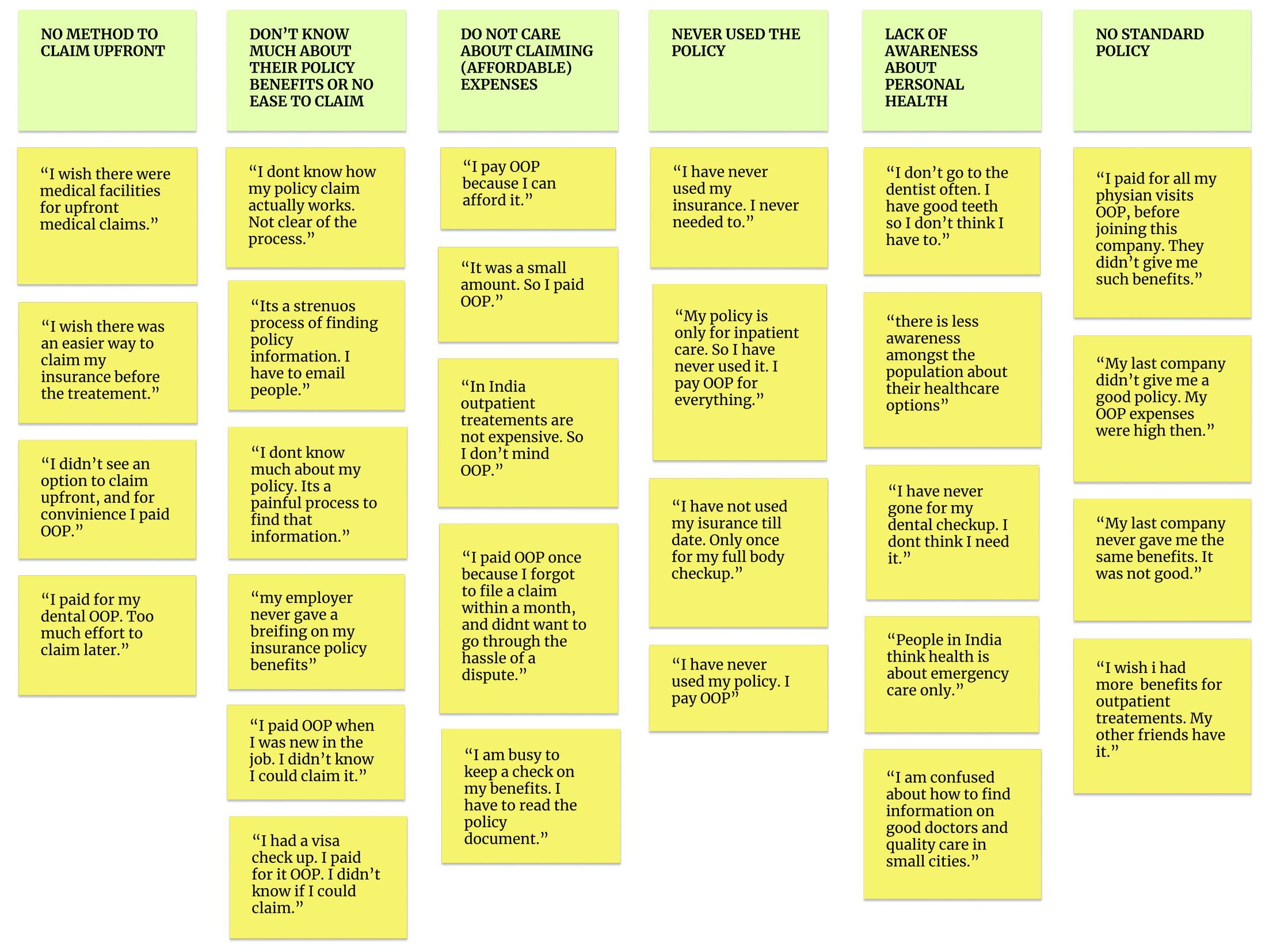
Many patients find it tedious to look for information about their own health benefits and how/what to claim in their insurance.
Many employers in India do not give proper briefing about health benefits to employees and the process of claims is strenuous, because of which patients end up paying OOP.
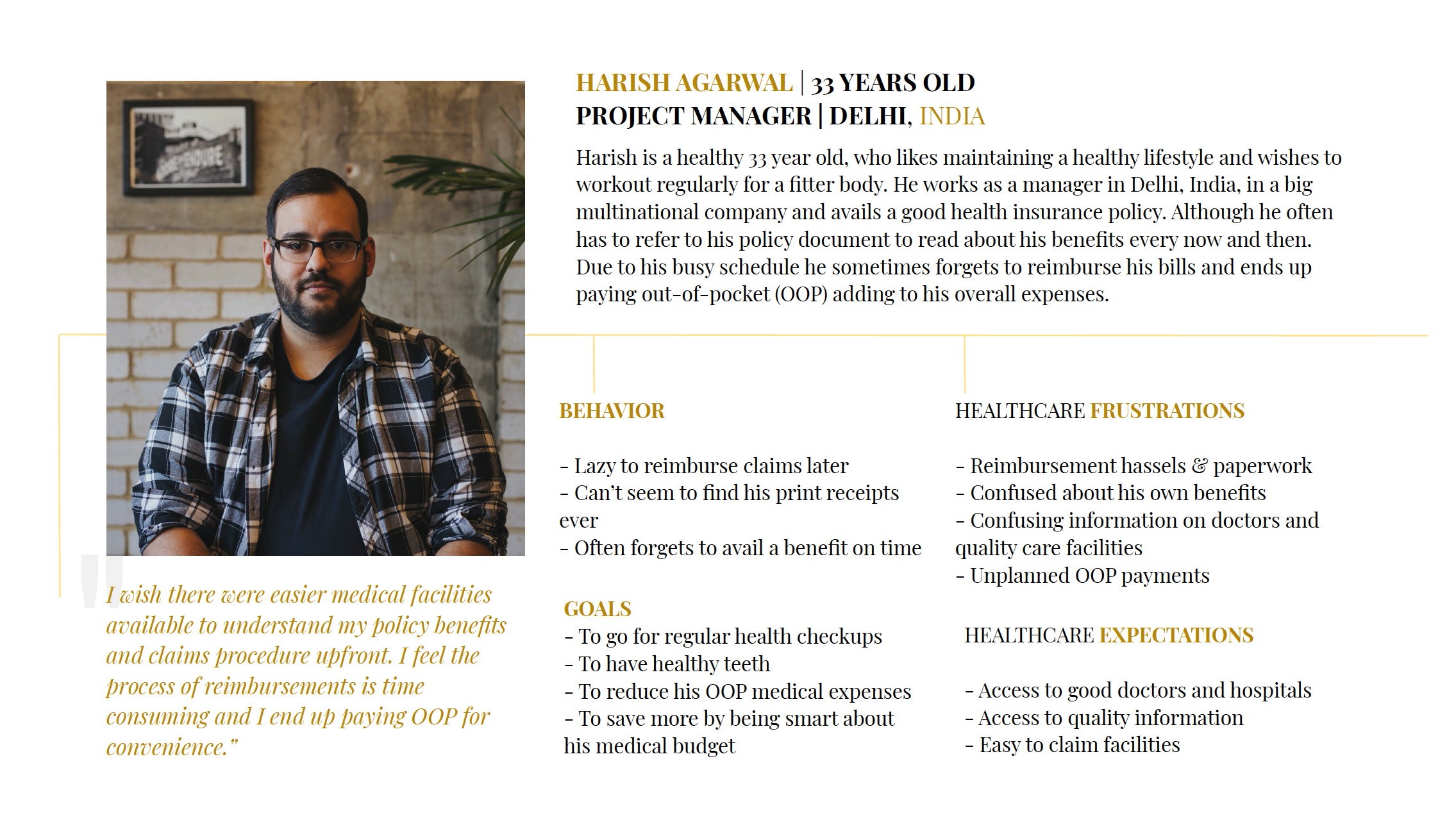
Based on my key insights, I created the persona of Harish. He is a 33-year-old Project Manager in a big multinational company, enjoying the lifestyle of a metropolitan city like Delhi. He avails a premium healthcare policy as a part of his annual package but still incurs high OOP medical expenses.
I wish there were easier medical facilities available to understand my policy benefits and claims procedure upfront. I feel the process of reimbursements is time consuming and I end up paying OOP for convenience.
Ideation & Prototyping
Once I had my insights and a potential opportunity of design intervention in place – I started with my ideating process at a granular level of penning down my user stories. As a millennial, what are certain features I want on this mobile platform to fulfill specific actions? After exploring many epics, I went ahead with the most critical epic/set of user stories – “ease of finding healthcare insurance benefits and details.”

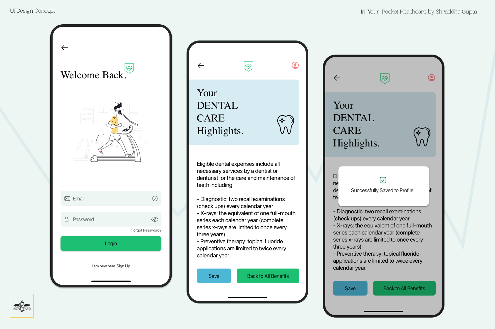
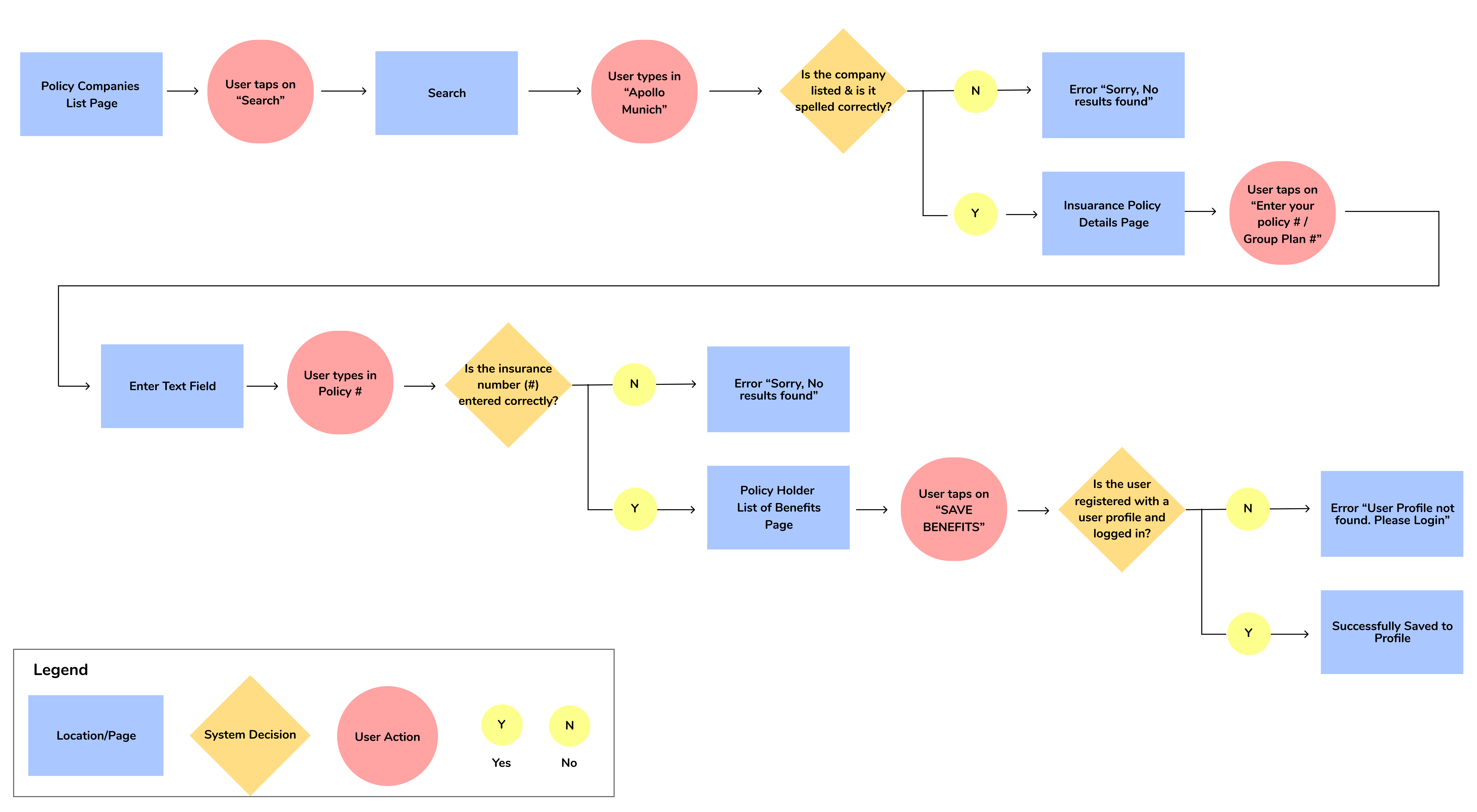
Moving forward, I picked up a single user story to design a task flow diagram. It was essential for Harish to quickly find his insurance benefits. He wanted a creative solution to eliminate going through the strenuous activity of reaching out to his HR manager to his healthcare provider for long hours. He also wanted the ability to search and save his benefit information in his smartphone to refer to it quickly at any time.
Choosing this as my primary task, I laid out a task flow diagram, considering system decisions to effectively incorporate warning states and error states in my app design.
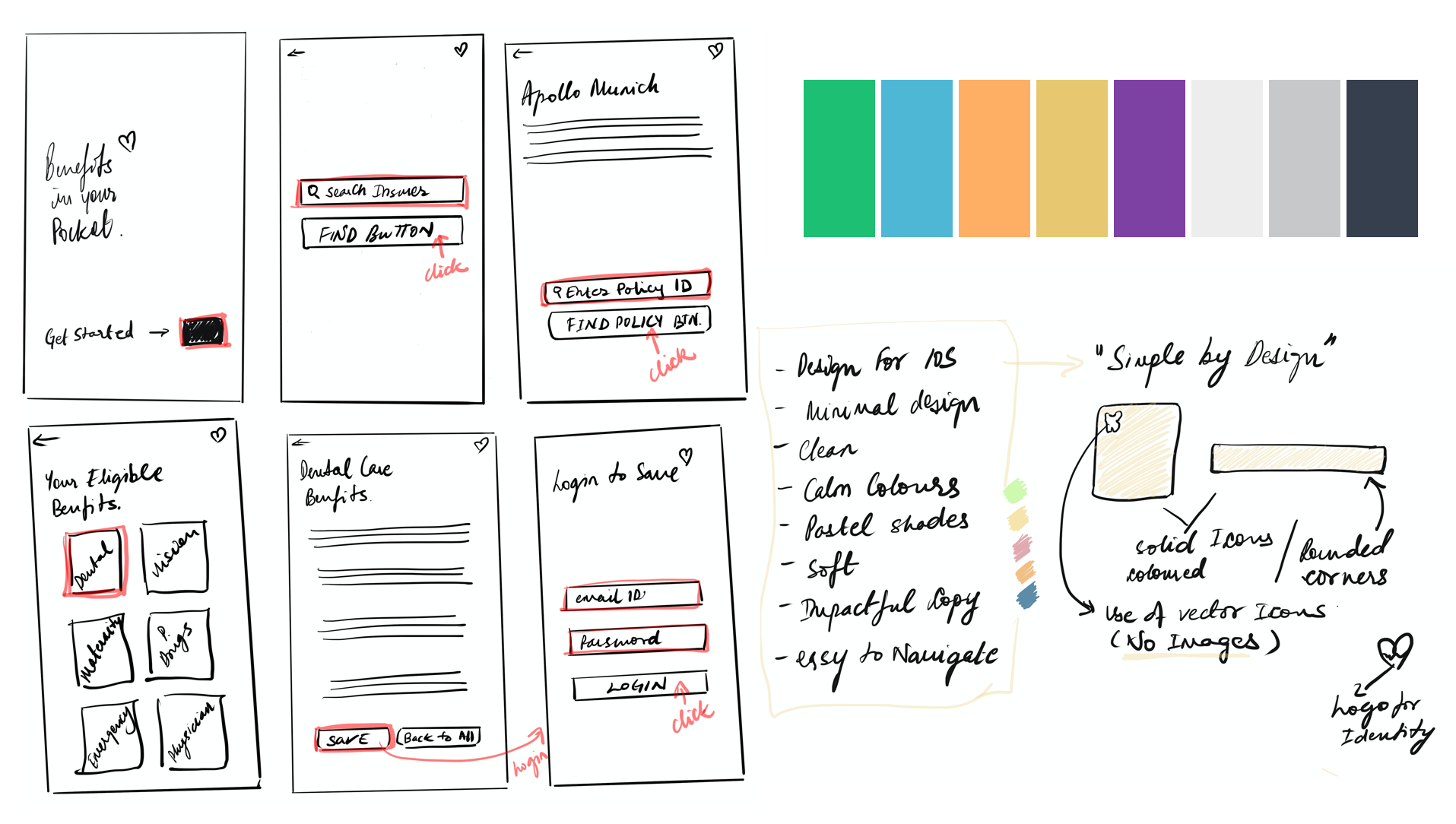
To visualize my solution as a native app, I started putting my thoughts into pen and paper sketches. I designed a basic structure of my app to visualize flows and CTA’s, and some UI inspirations I could play around with. I did a series of crazy 8’s. With peer feedback, I zeroed down to one idea that I wanted to develop further into mid-fidelity prototypes.
Usability Testing
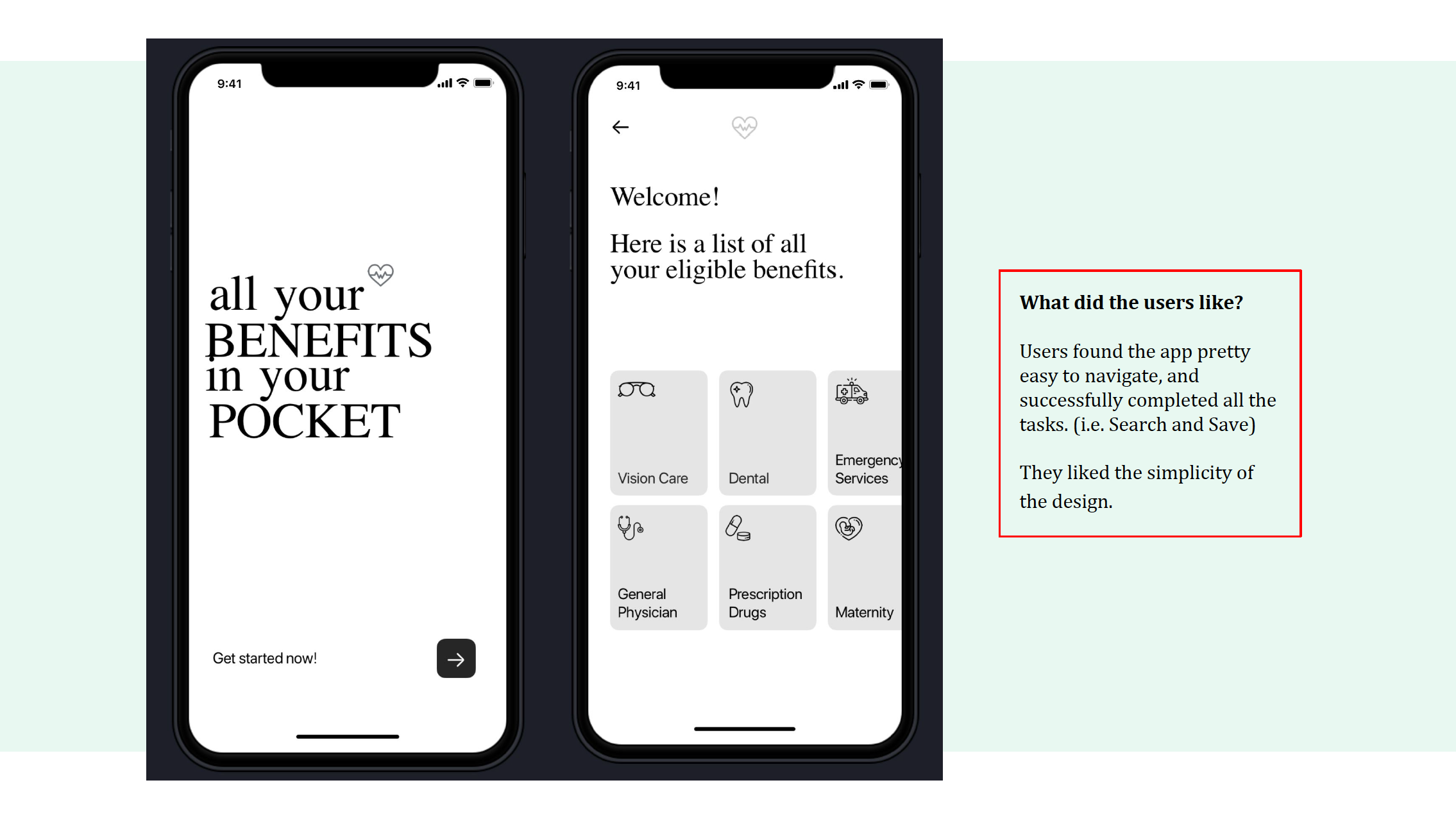
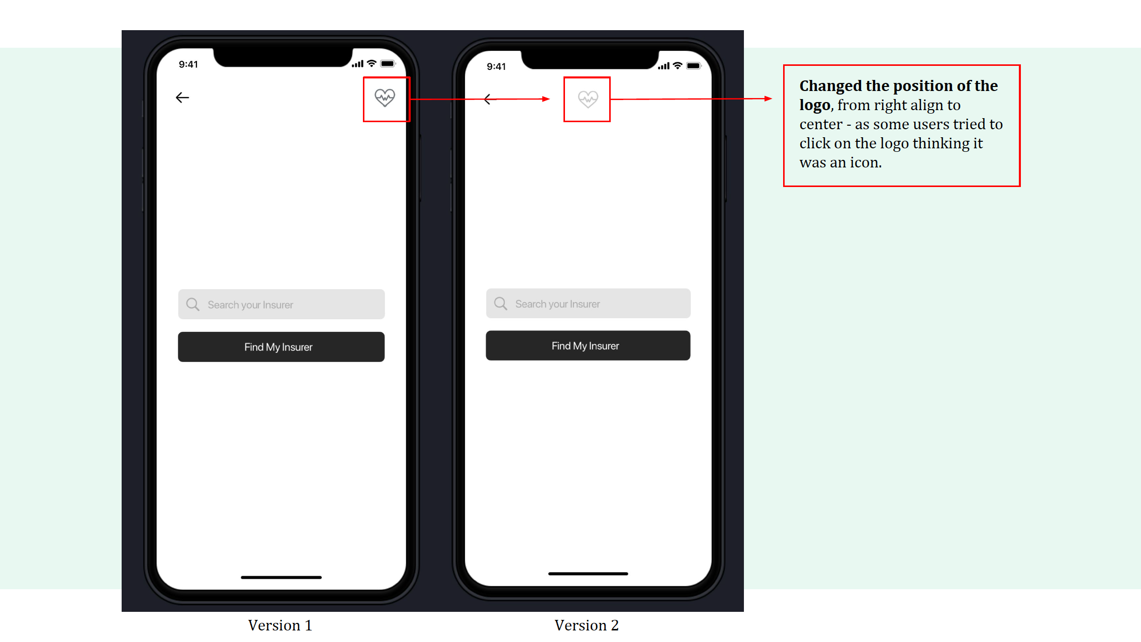
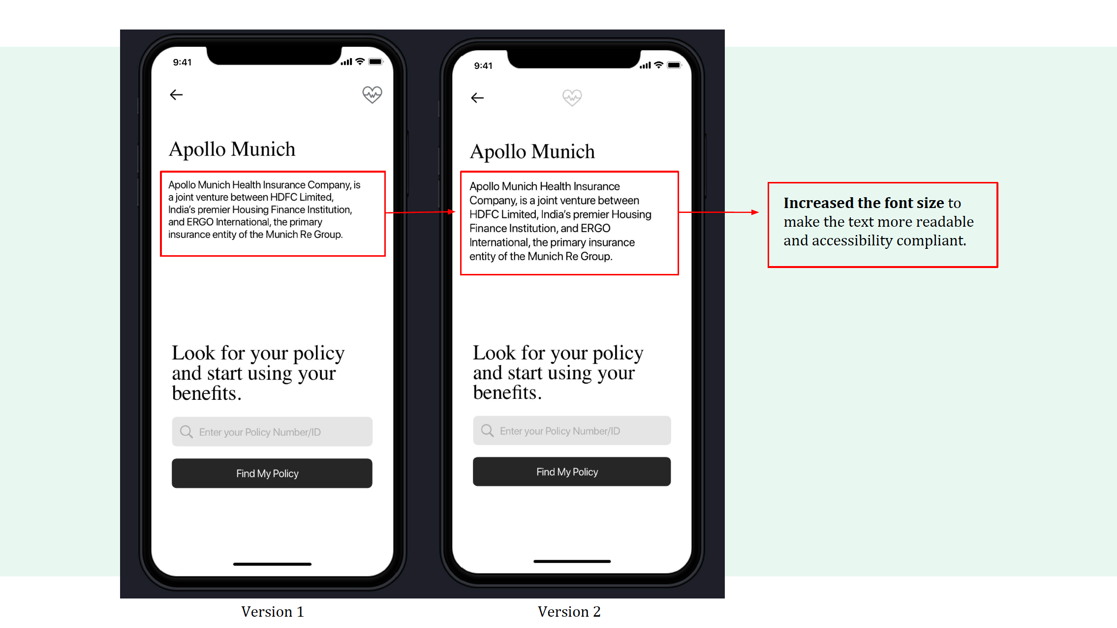
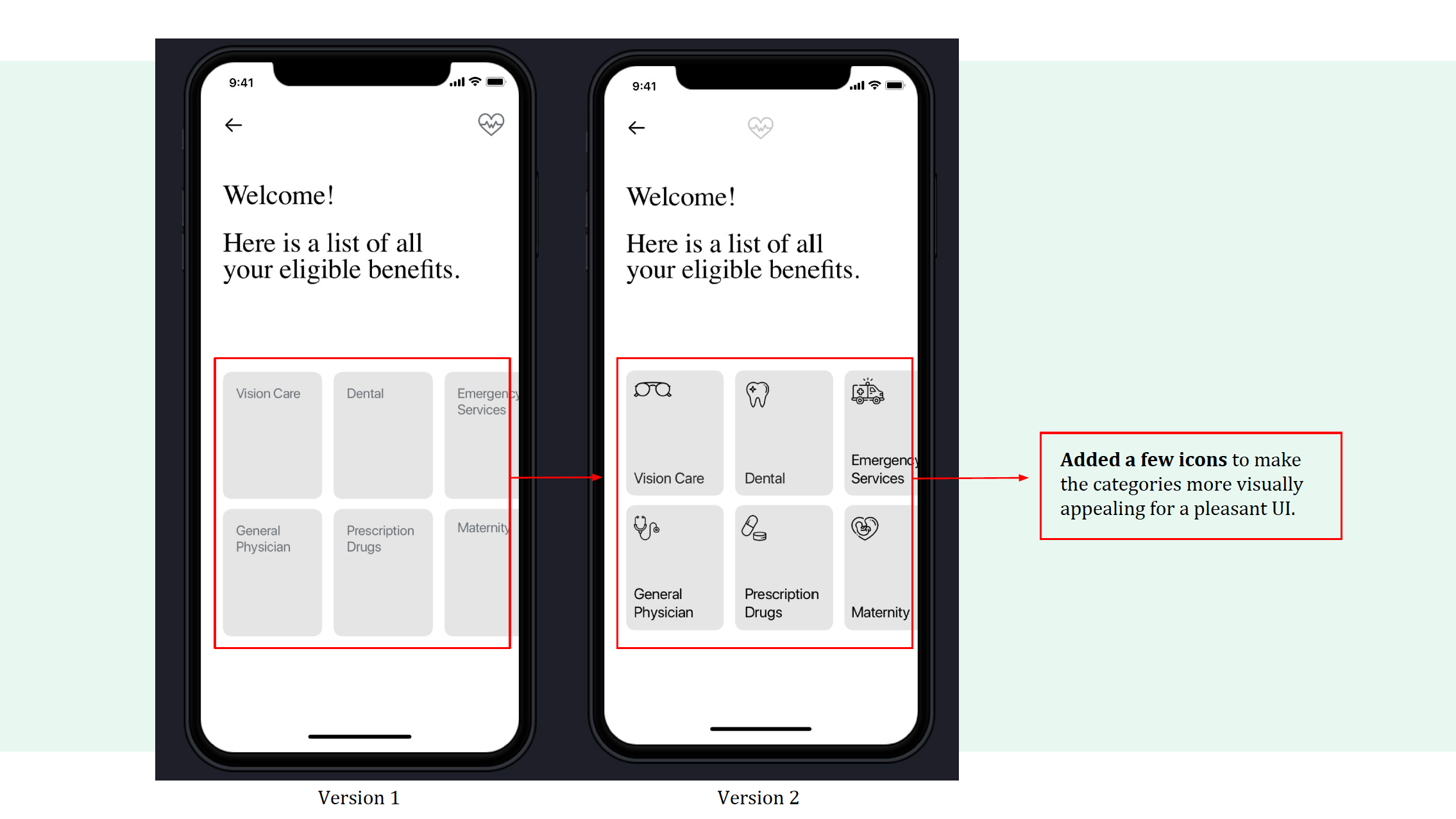
After the first round of user testing of the mid-fidelity prototype, I made a few visual changes to the app design, such as increasing the font size to make the content accessibility compliant. I also changed the position of the logo to align with a typical user’s mental model. I added a few icons to the overall design to make the app more visually appealing.
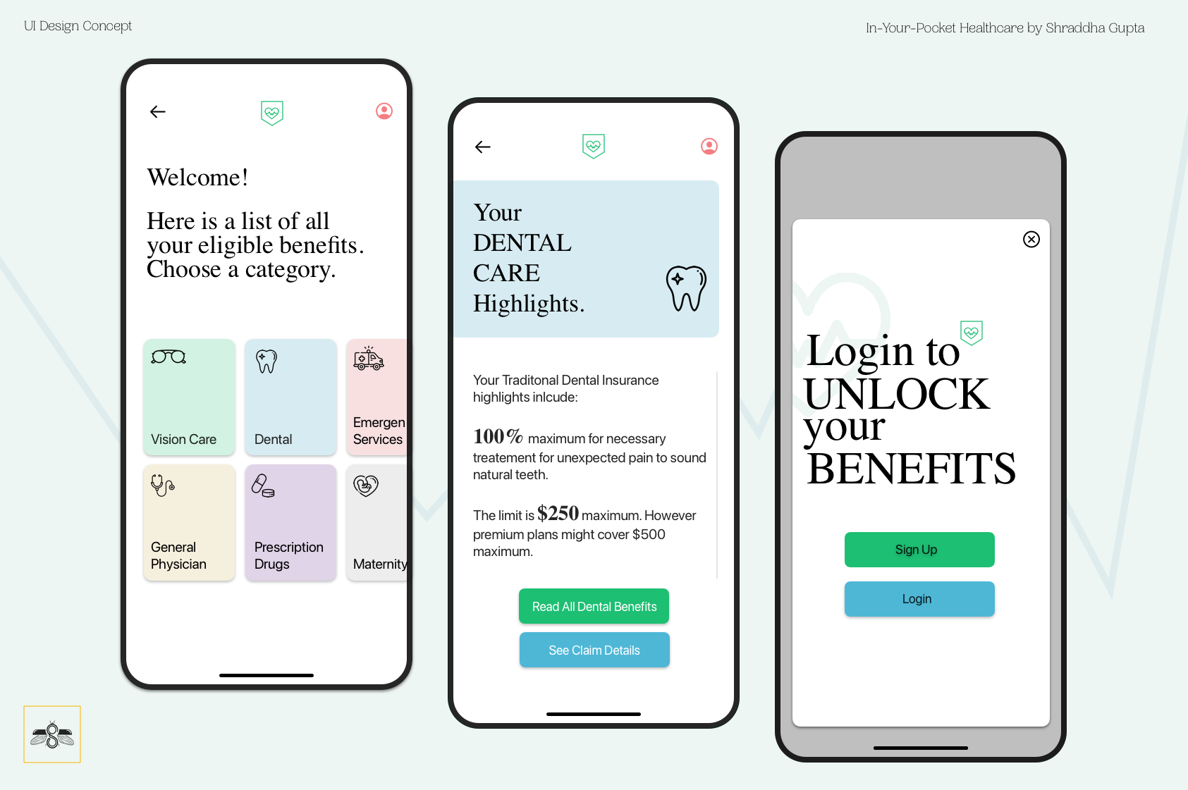
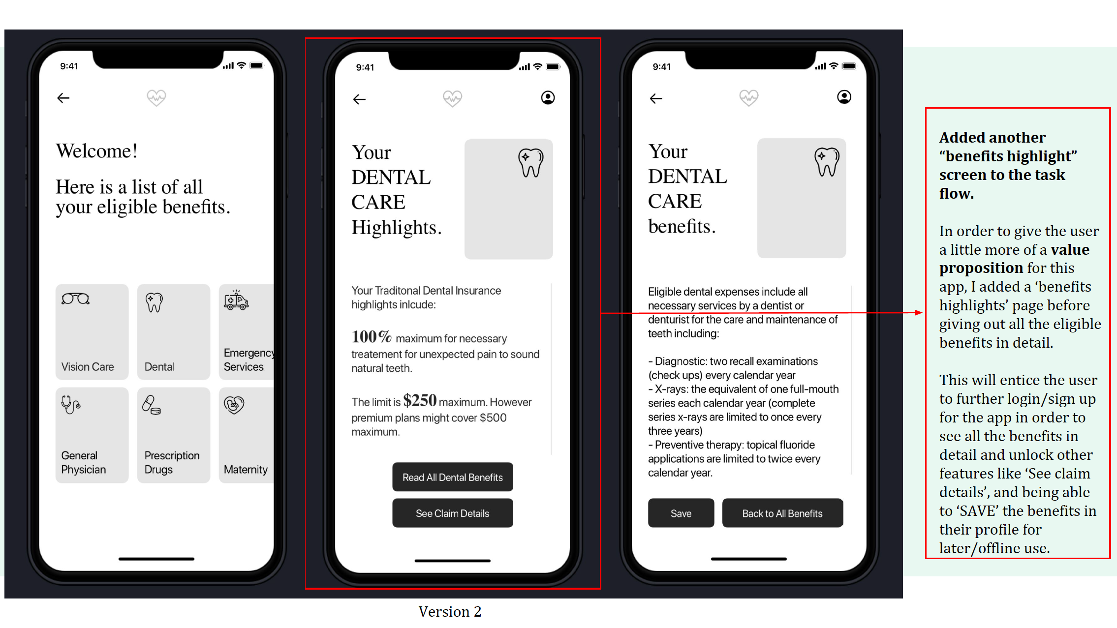
As this app’s task flow requires the user to login later into the app experience, I made a few changes to the information architecture. The aim is to let the user experience a bit more of what the app offers to make an informed decision and then buy the app to unlock all premium features.
Visual Identity
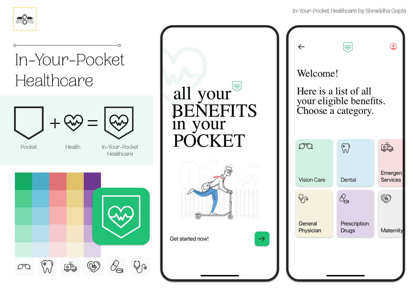
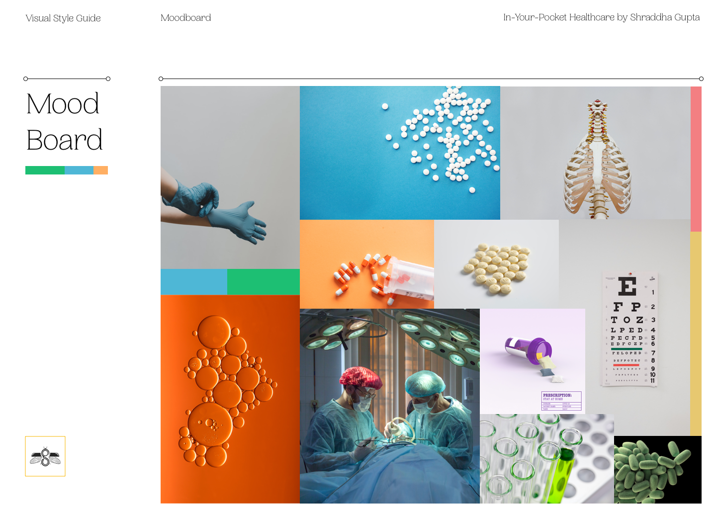
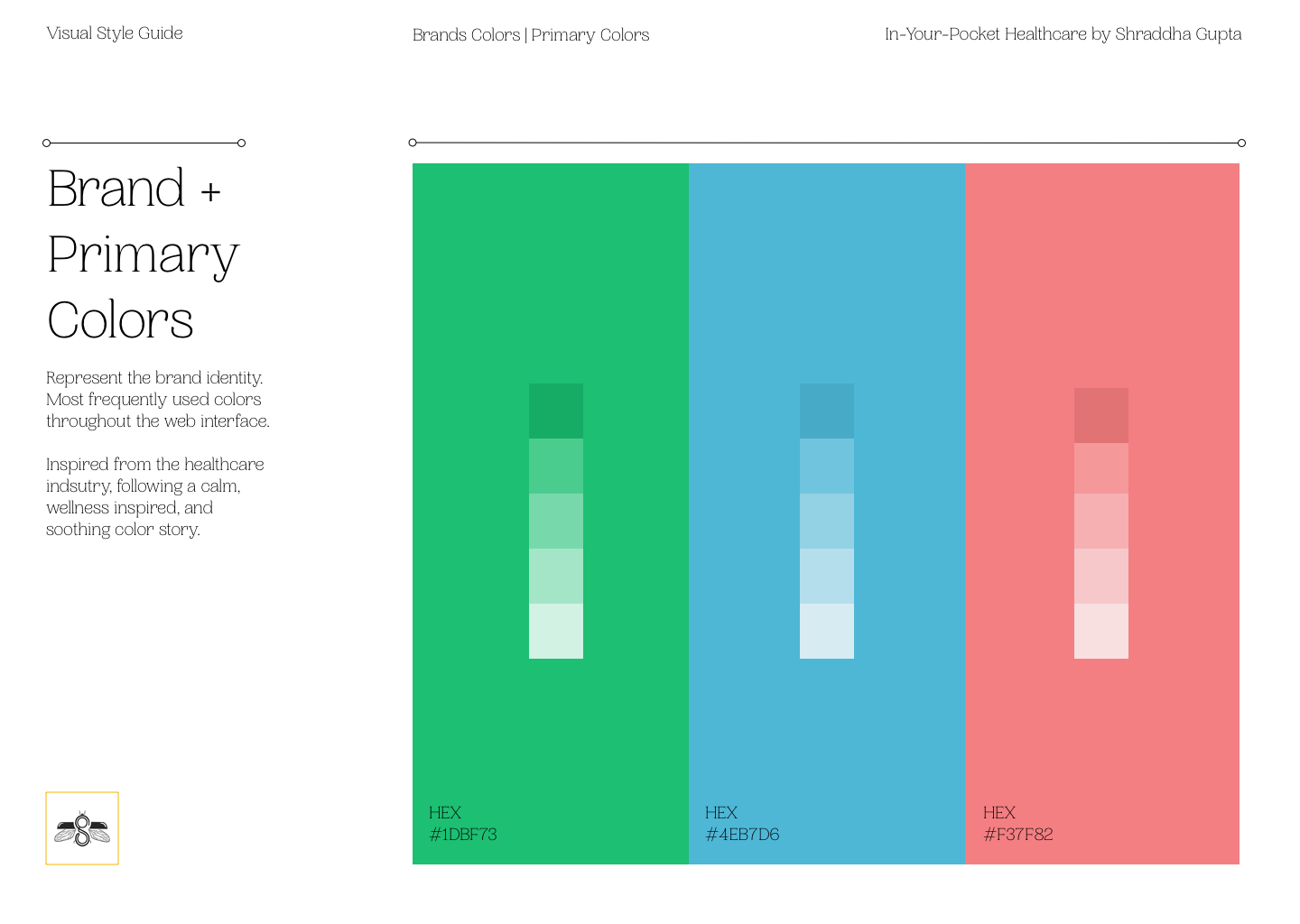
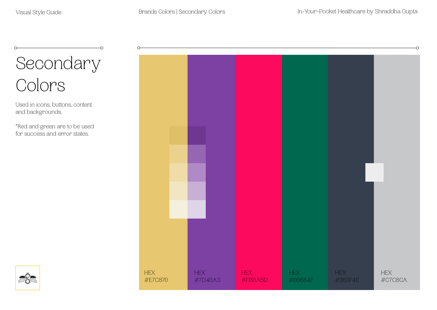
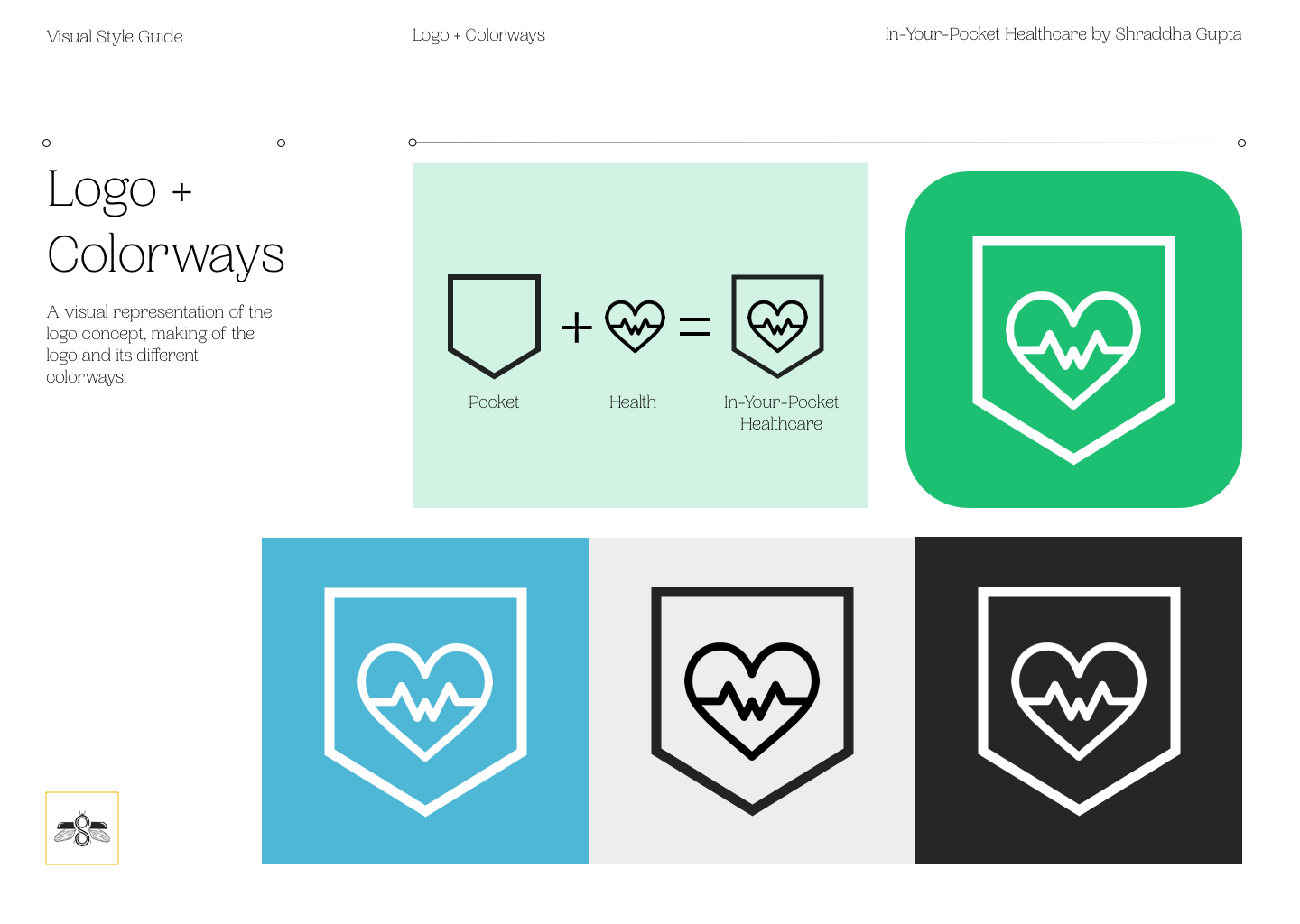
Once I made the required iterations to my mid-fidelity prototype, it was now time to give the app a visual identity. I started with a mood-boarding exercise to derive my app’s overall mood, primary and secondary colors. I also designed a logo for the app icon and in-app branding inspired by a ‘pocket’ and ‘health’ combined concept.
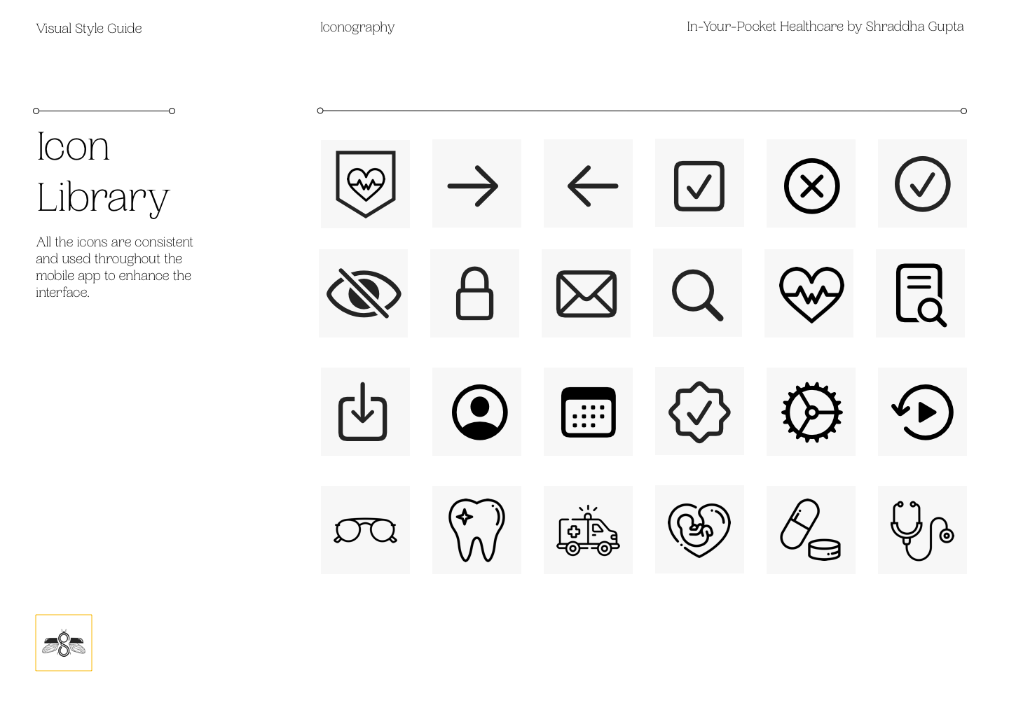
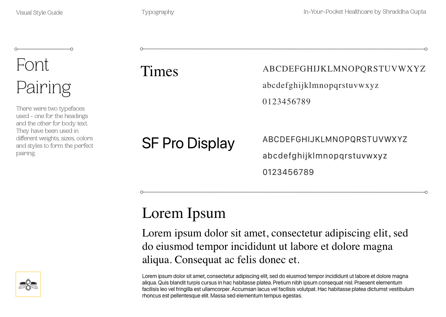
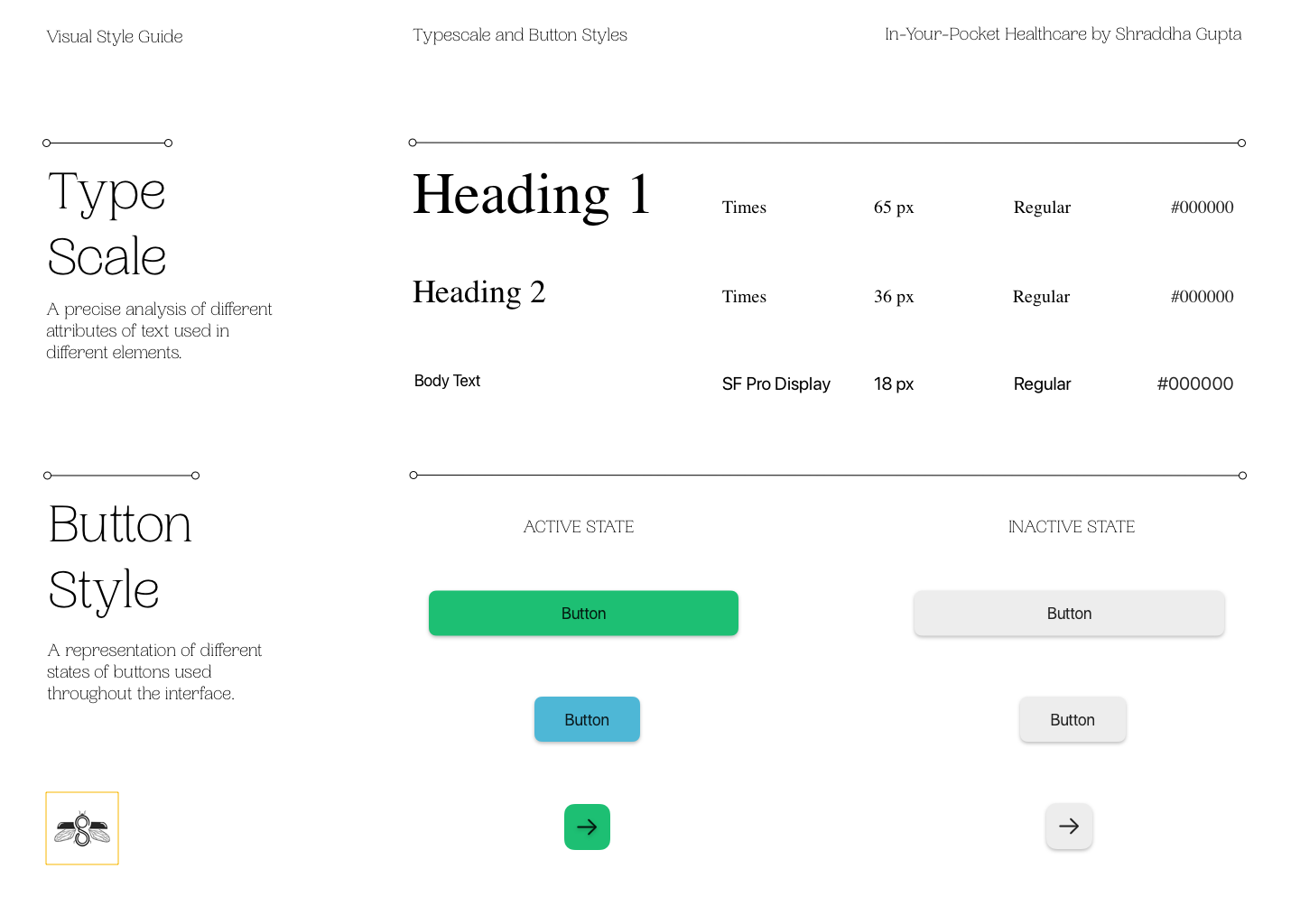
Moving on, I decided on some font pairings and type-scales for content, along with some button styles in active and inactive states. Organizing everything as per industry standards, I made a UI style guide for the whole app to put the entire visual identity together in one place.
Final Prototype
Once I started working on my high-fidelity prototype, I refined and redesigned a few of my prototype screens from previous feedback I had received. Without a doubt, the colors, the app name, and the logo helped me visualize my own product better, which also streamlined my design thinking further.
By this point in my project, I had conducted in-depth research on successful competitor profiles globally. I had a fair idea of what a typical user’s mental model looks like on similar platforms. Incorporating that research and some reference illustrations – this final iteration became a more robust app design for my project.

